They say, “You never get a second chance to make a first impression,” and in the business world, your website often serves as that first impression. It’s more than just a digital brochure; it’s your 24/7 salesperson. But simply having a website isn’t enough it needs to convert visitors into customers.
One of the studies by Forrester Research show that improving user experience can increase conversion rates by up to 400%, proving how essential thoughtful design and functionality are. Whether you’re looking to boost sales, gather leads, or encourage sign-ups, your website should be designed to guide visitors effortlessly toward action.
In this blog, we will discuss tried-and-true strategies to help you build a website that doesn’t just look good but delivers results.
Why Conversion-Focused Design is Essential for Business Websites
Focusing on conversions isn’t just a nice-to-have and it’s a must for business growth. A conversion-focused design ensures your website attracts visitors and turns them into customers. By improving the user journey, you make it easier for people to take action, whether it’s making a purchase, signing up, or contacting you.
This boosts revenue, improves customer acquisition, and enhances engagement metrics. When your website prioritizes user needs, it creates a seamless experience that drives results. Simply put, better conversions mean better business outcomes, and investing in UI/UX design services can help you achieve them!
Core Elements of a Conversion-Focused Website
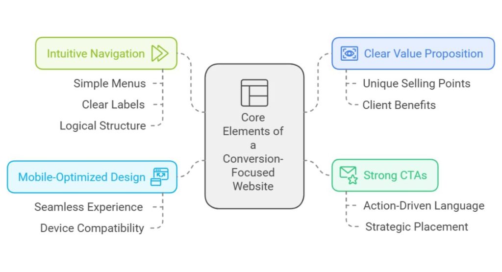
A conversion-focused website brings together key features to turn visitors into customers. Clear CTAs guide actions, while mobile-friendly design and fast load times ensure a smooth experience on any device. High-quality content, simple navigation, and trust signals build confidence.
User-friendly forms and consistent branding add professionalism and make interactions easy. When these elements work together, your site becomes a powerful tool for business success.
1. Clear Value Proposition and Messaging
A clear value proposition is essential for your website development services. It tells visitors exactly what you offer and why it matters to them. By highlighting your unique selling points and the benefits clients can expect, you make it easy for potential customers to understand your value.
As Peep Laja, founder of ConversionXL, says, “A value proposition is about telling the right people why they should choose you, not your competitors.” Effective messaging builds trust and encourages visitors to explore your services further.
2. Strong Calls-to-Action (CTAs)
Strong CTAs are important for encouraging visitors to take action. Use clear, action-driven language like “Start Your Free Trial” or “Get a Quote” to guide users effectively. Ensure the placement of your CTAs is strategic at key points in the user journey where decisions are made.
Design also matters; use bold colors and standout buttons to grab attention. Research on Hubspot shows personalized CTAs can convert up to 202% better, proving that tailoring your message to your audience can make a big difference in driving conversions.
3. Mobile-optimized and Responsive Design
“Meet your audience where they are” has never been more relevant for websites. With users accessing your site from phones, tablets, and desktops, a mobile-optimized and responsive design is crucial. It ensures a seamless browsing experience across all devices, helping to keep visitors engaged and driving more conversions.
Here’s why responsive design is essential:
- Higher Conversions: Captures and retains mobile traffic effectively.
- Brand Consistency: Maintains a professional, cohesive look across all platforms.
- Device Adaptability: Automatically adjusts to any screen size for optimal viewing.
- Smooth User Experience: Visitors can easily navigate without zooming or scrolling awkwardly.
4. Easy and Intuitive Navigation
“Make it easy, and they will stay longer” perfectly sums up the importance of intuitive navigation. It helps users find what they need without frustration. Incorporating simple menus, clear labels, and a logical structure showcases the UI/UX investment benefits, as visitors can easily explore and engage with your content.
Intuitive navigation minimizes clicks, reduces confusion, and keeps users on your site longer. A well-structured website creates a smooth journey, ensuring users don’t leave out of frustration. When finding information feels effortless, it builds trust and encourages users to take the next step, whether it’s making a purchase or getting in touch.
Conversion Optimization Techniques for Business Websites
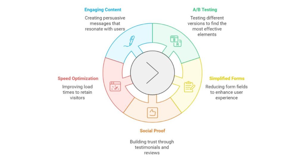
Boosting conversions starts with smart strategies that make every visitor’s experience count. For website development services, this means leveraging tools like A/B testing to refine layouts and CTAs that grab attention.
Personalization keeps users engaged while simplifying processes like checkout prevents drop-offs. Use heatmaps to track user interactions, add social proof for trust, and implement retargeting to reconnect with lost leads. Combined with fast-loading, high-performing pages, these techniques turn visitors into loyal customers.
1. A/B Testing for Continuous Improvement
Making improvements to your website isn’t guesswork, it’s all about data. Testing different versions of key elements like CTAs, layouts, or copy helps you understand what your visitors respond to most. By analyzing results, you can continuously refine your site for better conversions.
Here’s how it works:
- Compare Layouts: See which page designs keep users engaged longer.
- Optimize Copy: Test different headlines or descriptions to find what resonates.
- Test CTAs: Experiment with wording, color, or placement to boost clicks.
- Adapt to Preferences: Align your site with user behavior for ongoing success.
- Track Results: Use data to measure which changes improve performance.
2. Simplifying the Contact and Sign-Up Forms
Streamlining your forms can significantly boost conversions. By keeping them short and simple, you reduce friction for users. Removing unnecessary fields, using clear labels, and focusing on essential information make forms less intimidating and easier to complete.
As the author of Web Form Design, Luke Wroblewski notes, “The best way to get users through forms quickly is to remove all unnecessary fields.” Clear design and easy submission improve user experience and increase the chances of capturing valuable leads or contact information. Simplified forms are small changes that can deliver big results.
3. Social Proof and Testimonials
People trust what others recommend, making social proof a key ingredient for building credibility. Customer testimonials, reviews, and case studies show potential buyers that others have had positive experiences with your business. These trust signals create confidence and influence decisions.
When visitors see real stories or numbers, they feel reassured about choosing you. Social proof taps into peer influence, making it a powerful tool for increasing conversions. Highlighting authentic experiences on your site can turn hesitant visitors into confident customers. Trust builds business!
4. Optimizing for Speed and Performance
Speed matters a lot! Low-loading pages can frustrate visitors, causing them to leave before they even explore your content. Using techniques like optimizing images, enabling caching, and streamlining your code with expert web development services can significantly improve load times and keep users engaged.
A fast-performing website not only enhances user satisfaction but also increases the chances of visitors taking action. Quick load times create a smooth experience that keeps users coming back for more.
5. Creating Engaging and Persuasive Content
Your website’s content is the voice of your business, guiding visitors toward action. To connect with users, focus on addressing their needs and showcasing how your services solve their problems. Benefits-oriented language combined with persuasive storytelling creates a message that feels personal and impactful.
According to the Nielsen Norman Group, users often decide within 10–20 seconds whether to stay on a page, making engaging content crucial. By using clear calls-to-action and value-driven messaging, you can keep visitors interested and turn them into loyal customers.
Essential Features for Conversion-Driven Websites
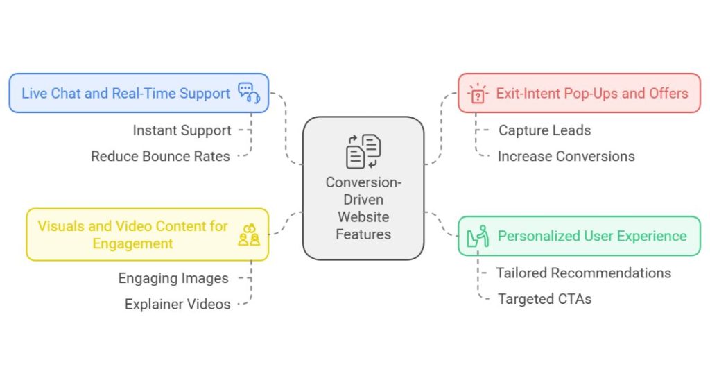
To turn visitors into customers, your website needs the right mix of features that drive engagement and action. Integrating live chat ensures instant support, while exit-intent pop-ups offer timely incentives to capture attention before users leave.
Personalizing content and recommendations based on user behavior makes the experience more relevant. Adding interactive visuals and videos enhances engagement, helping users connect with your services and encouraging them to take the next step.
1. Live Chat and Real-Time Support
Providing instant support through live chat is one of the best ways to improve conversions. It allows you to engage visitors, answer their questions, and resolve concerns in real time, which helps reduce bounce rates.
By offering quick responses, either through live agents or chatbots, you create a seamless experience that keeps users engaged. This immediate support builds trust and encourages visitors to take action, making it easier for them to convert into customers.
2. Exit-Intent Pop-Ups and Offers
“Don’t let potential customers slip through the cracks.” Exit-intent pop-ups can be a powerful tool for capturing leads before users leave your site. According to OptinMonster, exit-intent pop-ups can increase conversions by up to 35%, making them an effective strategy for preventing bounce rates and boosting lead capture.
These timed offers, presented when a visitor attempts to navigate away, provide a final chance to retain them with valuable discounts or content. This strategy can help retain visitors and increase conversions.
3. Personalized User Experience
“Make it personal, and they’ll stay longer.” Personalization is a powerful tool for guiding users through a more engaging and relevant journey on your website. By using data-driven insights, you can offer tailored product recommendations, content suggestions, and targeted CTAs that resonate with each visitor’s preferences and behavior.
As Brian Halligan, CEO of HubSpot, says, “Personalization is no longer a luxury, it’s a necessity.” When you customize your website’s experience, you create a stronger connection with users, which increases engagement, builds trust, and ultimately drives higher conversion rates. Personalizing the journey makes visitors feel valued, leading to greater satisfaction and a higher likelihood of them returning or making a purchase.
4. Visuals and Video Content for Engagement
Humans are naturally drawn to visuals, so using engaging images and videos on your website is a great way to grab attention and drive conversions. Whether it’s through explainer videos, product showcases, or other forms of visual content, these elements make your website more appealing and informative.
Here’s why visuals and videos are key for engagement:
- Capture Attention: Visuals make your website more eye-catching and memorable.
- Simplify Information: Videos and images help explain complex products or services.
- Build Trust: High-quality visuals boost credibility and make your brand look professional.
- Increase Conversions: Engaging content keeps users on your site longer and encourages action.
Incorporating visuals and videos makes your website more engaging, leading to higher conversion rates. They help convey your message quickly, increase user interaction, and boost trust in your brand.
Leveraging Analytics for Continuous Conversion Optimization
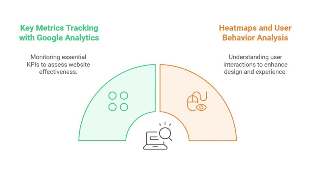
“You can’t improve what you don’t measure,” and when it comes to website performance, analytics are key to driving continuous improvement. Tools like Google Analytics, heatmaps, and A/B testing provide valuable insights into user behavior and conversion patterns.
By analyzing funnel data and identifying drop-off points, you can optimize the user journey. Real-time data allows for quick adjustments, ensuring your site is always performing at its best and maximizing conversions. With ongoing monitoring, your website’s effectiveness will continue to grow.
1. Tracking Key Metrics with Google Analytics
Google Analytics is an essential tool for tracking key performance indicators (KPIs) that help assess your website’s effectiveness. By monitoring metrics like bounce rate, time on page, and conversion rates, you can gain a deeper understanding of user behavior and identify areas for improvement.
For instance, a study by Backlinko found that the average bounce rate across all industries is 41% to 55%, indicating that a significant portion of visitors leave without engaging further. Google Analytics allows you to track these metrics in real-time, providing the insights needed to make informed, data-driven decisions and continuously optimize your site for better performance.
2. Heatmaps and User Behavior Analysis
Understanding how users interact with your website is crucial for optimizing its design and user experience. Heatmaps give you a visual representation of where users click, scroll, and where they drop off, providing valuable insights into user behavior.
Here’s why tracking user behavior is essential:
- Enhance Engagement: Adjust content and design to keep users engaged longer.
- Spot Drop-Off Points: Pinpoints where users leave the site and fix problem areas.
- Identify Click Patterns: Understand which areas attract the most attention.
- Refine User Flow: Optimize navigation to guide visitors more efficiently.
Heatmaps allow you to make data-driven design decisions that lead to better user experiences and higher conversions. This analysis helps you identify which parts of your site are engaging and which need improvement.
Conclusion
Creating a conversion-focused website goes beyond attractive visuals, it’s about crafting a seamless user experience that drives action. Focus on best practices like clear navigation, compelling CTAs, fast load times, and mobile responsiveness to ensure your site is engaging and optimized for user needs.
To maximize success, continuous improvement is key. Regularly test your website’s performance, gather user feedback, and adapt to changing customer behaviors. This iterative approach keeps your site relevant and impactful, building trust and driving long-term results.
Looking to turn your website into a conversion machine? Softnix is the partner you can count on. With deep expertise in providing top-notch web design services, building high-conversion strategies, innovative UX/UI designs, and tailored solutions, we empower businesses to achieve measurable online success.
FAQs for Bulding Conversion-Focused Websites for Business
What elements are essential for a conversion-focused website?
A conversion-focused website needs clear calls-to-action (CTAs), a mobile-friendly design, fast load times, high-quality content, simple navigation, and trust signals like testimonials. These elements help guide visitors through a smooth user journey, making it easy for them to take action and convert.
How can I improve my website’s conversion rate?
To improve your website’s conversion rate, focus on optimizing CTAs, simplifying forms, enhancing mobile responsiveness, and ensuring fast page load times. Use A/B testing, social proof, and personalization to refine the user experience, making it easier and more appealing for visitors to take action.
What are the best practices for designing a CTA?
The best CTAs are clear, action-oriented, and easy to find. Use strong, concise language like “Get Started” or “Sign Up Now” and place them strategically on your pages. Make sure the design stands out with contrasting colors and proper spacing to grab the user’s attention.
How do I optimize my website for mobile users?
To optimize for mobile users, ensure your website is responsive, meaning it adjusts to any screen size. Simplify navigation, use larger fonts, and reduce load times for mobile users. Test your website on different devices to ensure a smooth, engaging experience on smartphones and tablets.
What is A/B testing, and how does it help conversions?
A/B testing involves comparing two versions of a webpage to see which one performs better. By testing elements like CTAs, headlines, and layouts, you can make data-driven decisions to improve user engagement and conversions. It helps you understand what resonates with your audience and optimizes results.
How important is page speed for conversion rates?
Page speed is crucial for conversions, as slow-loading pages can lead to frustration and high bounce rates. Users expect fast experiences, and delays of just a few seconds can reduce conversions significantly. Optimizing images, reducing code, and using caching can help speed up your site.
What is the role of social proof on a business website?
Social proof, like customer reviews, testimonials, and case studies, builds trust with potential customers. It shows that others have had positive experiences with your business, making visitors feel more confident in their decision to convert. Social proof is a powerful tool for increasing credibility and conversions.
How can I create a clear value proposition?
A clear value proposition tells visitors what you offer, how it benefits them, and why they should choose you over competitors. Keep it simple, focused, and customer-centric. Highlight your unique selling points and use concise, compelling language that addresses your audience’s needs or pain points.
Why are exit-intent pop-ups effective?
Exit-intent pop-ups are effective because they capture visitors just before they leave the site. Offering a discount, special offer, or valuable content encourages them to stay or return. This strategy helps convert abandoning users into leads or customers by providing a final nudge before they exit.
How can I personalize the user experience on my website?
You can personalize the user experience by offering tailored product recommendations, content suggestions, and targeted CTAs based on user behavior. Use data to understand user preferences and display relevant offers, ensuring visitors feel engaged and understood. Personalization enhances relevance and increases the chances of conversion.
What metrics should I track to improve conversions?
To improve conversions, track metrics like bounce rate, conversion rate, time on page, and exit rate. Use tools like Google Analytics to monitor user behavior, A/B test results, and funnel analysis to identify drop-off points. Tracking these metrics helps you refine your site and boost conversions.
How does heatmap analysis help in conversion optimization?
Heatmap analysis shows where users click, scroll, and spend the most time on your site. By visualizing this data, you can identify areas that attract attention and areas where users drop off. This helps refine page design, improve user flow, and optimize the website to increase conversions.
What’s the best way to use visuals for engagement?
The best way to use visuals is to make them relevant, high-quality, and strategically placed. Use images and videos to explain your products, highlight key benefits, and keep users engaged. Visuals should grab attention, communicate information quickly, and create an emotional connection that drives action.
Why should I consider Softnix for building my website?
Softnix offers expert web design services tailored to create high-conversion websites. With a focus on user experience, SEO optimization, and cutting-edge design, Softnix helps businesses build engaging websites that drive results. Their team works closely with clients to create personalized solutions that meet business goals and boost performance.
How often should I test and update my website for conversions?
You should test and update your website regularly, ideally every 3–6 months, or after significant changes. Ongoing A/B testing, user feedback, and analytics reviews will help you stay on top of performance. Regular updates allow you to refine the user experience and adapt to evolving customer needs.

